ROBO Rate: The Hidden Psychology Behind Base & Dynamic Fees
I still remember sitting there, watching the ROBO price quote flicker on my screen — finger hovering over the confirm button, then pulling back, as if I were waiting for a signal I couldn't even name. After years in this space, green and red candles no longer frighten me. What frightens me now is that other feeling: being pulled along by a current you can't quite see, making decisions you can't quite explain.
Separating Truth from Priority
At its core, ROBO's rate model attempts something most protocols avoid: separating truth from priority. The base rate sets a floor — every transaction carries a minimum cost. The dynamic rate, meanwhile, reflects real-time demand. Pay more if you want to move faster; accept slower processing if you'd rather pay less. On paper, it's an elegant distinction. In practice, UX is never elegant, because UX doesn't live in formulas. It lives in the sensation of control.
That may be exactly why so many projects avoid talking about fees altogether. Fees are friction, and no amount of polish hides friction forever.
The Quiet Power of a Base Rate
The base rate does something difficult but essential: it stabilizes expectations. When there's a baseline cost, users can't fall into the illusion that transactions are nearly free — only to be blindsided by a sudden spike when the network heats up. That shock is what breaks trust. People will suspect the system long before they suspect the market.
A visible floor also gives the interface something coherent to say: here's what you'll pay at minimum, here's the typical range for this action, and here's what you should mentally prepare for — without turning every transaction into a guessing game.
Where UX Cracks First
The dynamic rate is where I watch most closely, because it's where the experience tends to break first. The problem isn't that fees rise — it's how fast they change, and how that change presses down on the user at exactly the wrong moment.
The pattern is painfully familiar: the initial estimate looks reasonable, so you proceed. You reach the signing step and the number has shifted. You go back to adjust, and it shifts again. The irony is sharp — a mechanism designed to reflect instantaneous demand ends up feeling like price slippage mid-flow. Users don't interpret this as market behavior. They interpret it as punishment for hesitating, even though hesitation is simply the self-preservation instinct of anyone still paying attention.
Three Things ROBO Must Own
If ROBO is serious about UX, there are three things it needs to commit to fully.
First: explainability. A number without a story is just a risk. Users will fill the blank space with suspicion — always.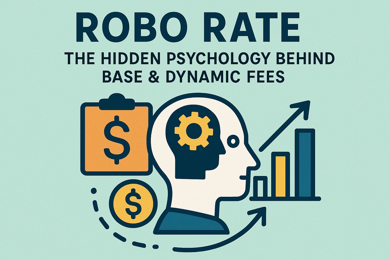
Second: consistency between the estimate screen and the confirmation screen. Even a small mismatch is enough to make people feel misled. Not suspicious — misled. That's worse.
Third: a genuine sense of choice. If I pay more, how much faster do I actually get? If I wait, how long is the wait — and why does it cost this much right now? Without answers to those questions, dynamic pricing isn't a feature. It's just friction with better branding.
Guardrails That Actually Help
There are ways to reduce friction without distorting the market. The quote should be locked for a short window — long enough for a user to complete the action without the number shifting mid-click. The feeling of "I saw one price, you charged another" is the fastest path to broken trust, and it doesn't take much of a delta to trigger it.
The interface should offer priority levels in plain language, paired with time estimates, failure probability, and expected volatility over the next few minutes. It could even suggest calmer windows for non-urgent transactions — not to push users away, but to show respect. Or at least, to tell the truth.
Different Users, Different Stakes
Dynamic fees hit different user groups very differently. Traders treat it as an operating cost — they accept it because profit is measured in minutes. Casual users trying to do something simple feel like they've been asked to pass an exam before they're allowed to proceed.
The presentation needs to work across both: deep enough for people who want to analyze, light enough for those who don't want to read but still need to understand, and above all, transparent in real time — not just buried somewhere in the documentation.
After several cycles, I've learned a difficult lesson: fees can be high, markets can be brutal — but if the experience is consistent and explainable, people will accept it the way they accept bad weather. Unpleasant, but not deceptive.
Want speed, pay more. Want cheap, accept slow.
#ROBO @Fabric Foundation $ROBO #blockchain #news #Binance #cryptouniverseofficial